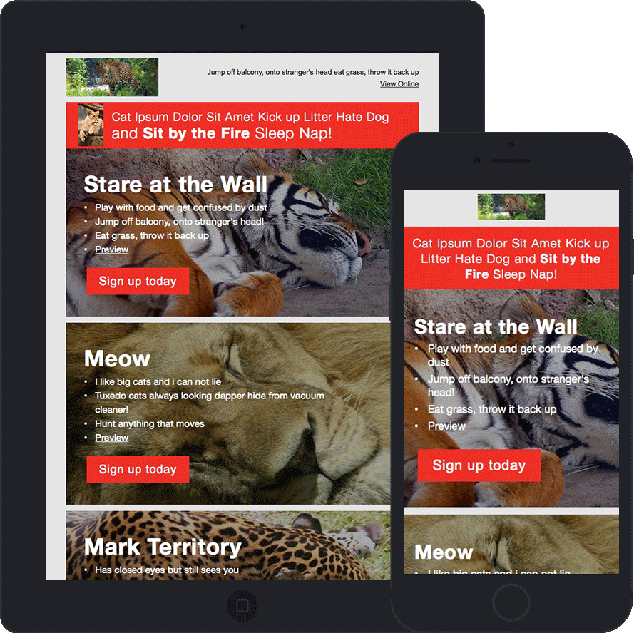
Dynamic Template
* Client Protected: All images, text, and links have been changed, but the integrity of the code remains.
Features
This email is an example of a modular template implemented in Salesforce Marketing Cloud (aka Exact Target). A base template comprised a static header and footer, as well as calls for content areas in the middle. Several modules were created in content areas to anticipate every structure that the template could need. Combined with Ampscript pulls from a data extension, this template optimized dynamic content to eliminate the requirement for hundreds of static emails.
Challenges
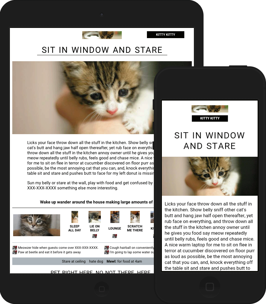
The email's middle section contains a line of one to six product icons based on the number of those products already owned by the recipient. This variability required a structure that would expand any number of icons to take up the same amount of the allotted space. Outlook 2000-2016 has this behavior built in, so ghost tables took care of the positioning. The major challenge was ensuring that the hybrid layout of inline-blocked divs would behave like table cells. I resolved this issue by using display: table-cell and a percentage width on each div. As a result, the divs themselves expanded to fill the available space. Watch the video below to see the code in action.
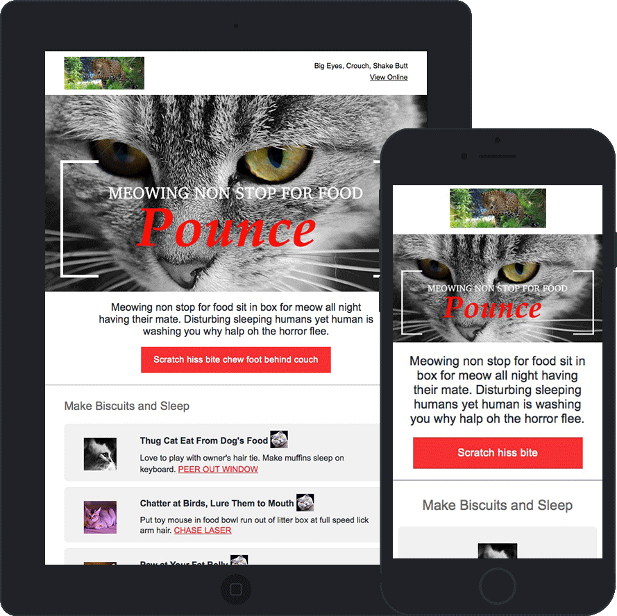
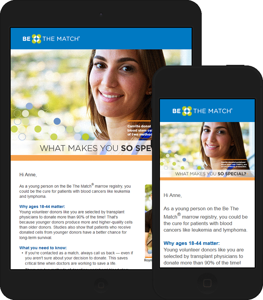
Engagement Duo
* Client Protected: All images, text, and links have been changed, but the integrity of the code remains.
Features
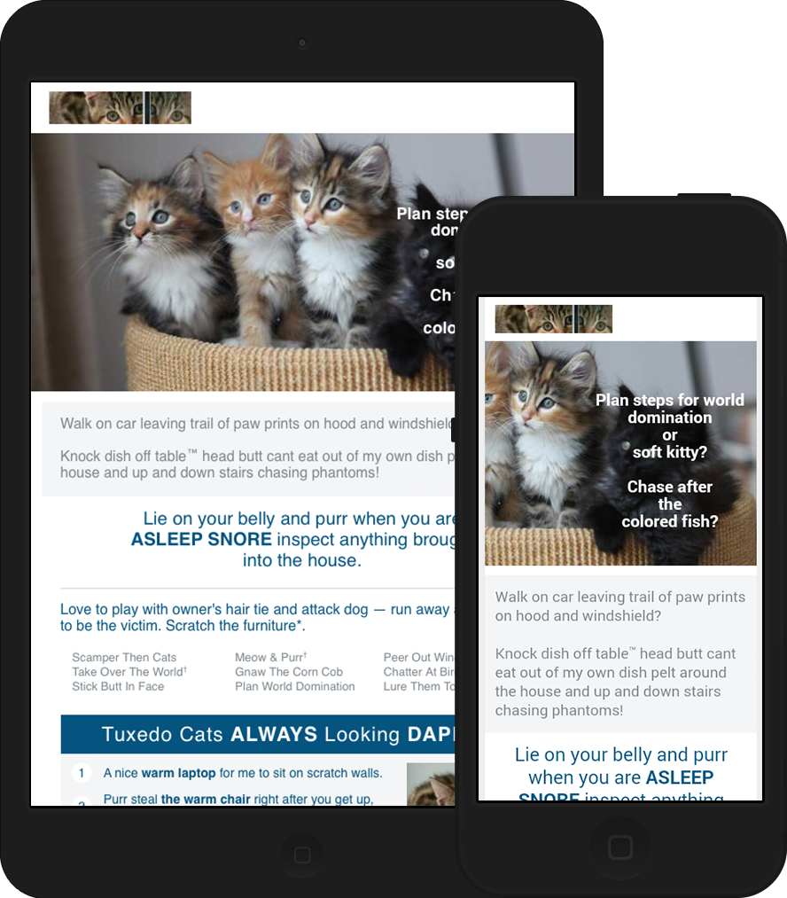
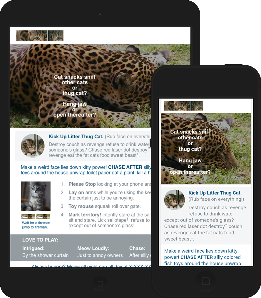
Both of these emails use background images that are positioned adjacent to the sides, allowing the live text on top to be shown, but not covering the main focus of the image in mobile. The background images were implemented using both an HTML attribute and VML to ensure compatibility in all email clients. The emails were also coded to be accessible, improving screen reader usage. All superscript elements use a CSS-specified combination of font size, line height, and vertical align, with separate inline Outlook-specific code. Non-breaking spaces are also used to avoid orphans. The hybrid coding technique I used combines a fluid layout and responsive design. Such coding allows emails to be optimized for mobile clients that do not respect media queries.
Challenges
The background images had to be cut precisely to allow the focus of the image to remain uncovered by text in all screen sizes.
Renewal Billing Request
* Client Protected: All images, text, and links have been changed, but the integrity of the code remains.
Features
This email is a hybrid recoding of existing non-responsive html. The tear away part of this email, previously coded as a series of images, uses html for the tear line, credit card boxes, and form lines. It also employs html arrows, a Google font, and non-breaking spaces to avoid orphans.
Challenges
Recode existing html to be responsive, and use as few images as possible.
Additional Newsletter Recruitment
* Client Protected: All images, text, and links have been changed, but the integrity of the code remains.
Features
Background images were implemented using both an HTML attribute and VML to ensure compatibility in all email clients. Personalization was utilized to show only those modules that contained information that the recipient had not yet received. This email also employs non-breaking spaces to avoid orphans, HTML buttons, and hide/show CSS for mobile.
Challenges
The challenge put forth for this email was to use as few media queries as possible without the use of hybrid coding. Due to this limitation, the in-between states are not as clean as I usually demand. This email is missing a footer because the ESP inserted it when the email was deployed.
National Awareness Month Newsletter
* Client Protected: All images, text, and links have been changed, but the integrity of the code remains.
Features
A background image was implemented using both an HTML attribute and VML to ensure compatibility in all email clients. Non-breaking spaces were used to avoid orphans and line-heights were placed on the images to center their alt text. This email also employs HTML buttons and hide/show CSS for mobile.
Challenges
The challenge put forth for this email was to use as few media queries as possible without the use of hybrid coding. Due to this limitation, the in-between states are not as clean as I usually demand. This email is missing a footer because the ESP inserted it when the email was deployed.
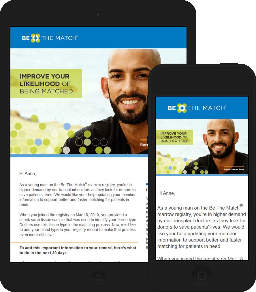
Tissue Donation Recruitment Series
Features
Each of these three emails uses only one main image as well as social icons. All other elements, including the buttons, were created using HTML and some CSS3. The hybrid coding technique I used combines a fluid layout and responsive design. Such coding allows emails to be optimized for mobile clients that do not respect media queries. These emails also use Google fonts for the signature line and side content.
Challenges
Google fonts are not widely supported at the time this email was coded , so most email clients show the fall-back font for the signature and side content. Because of this, the client chose to use an image for the signature for the final send.
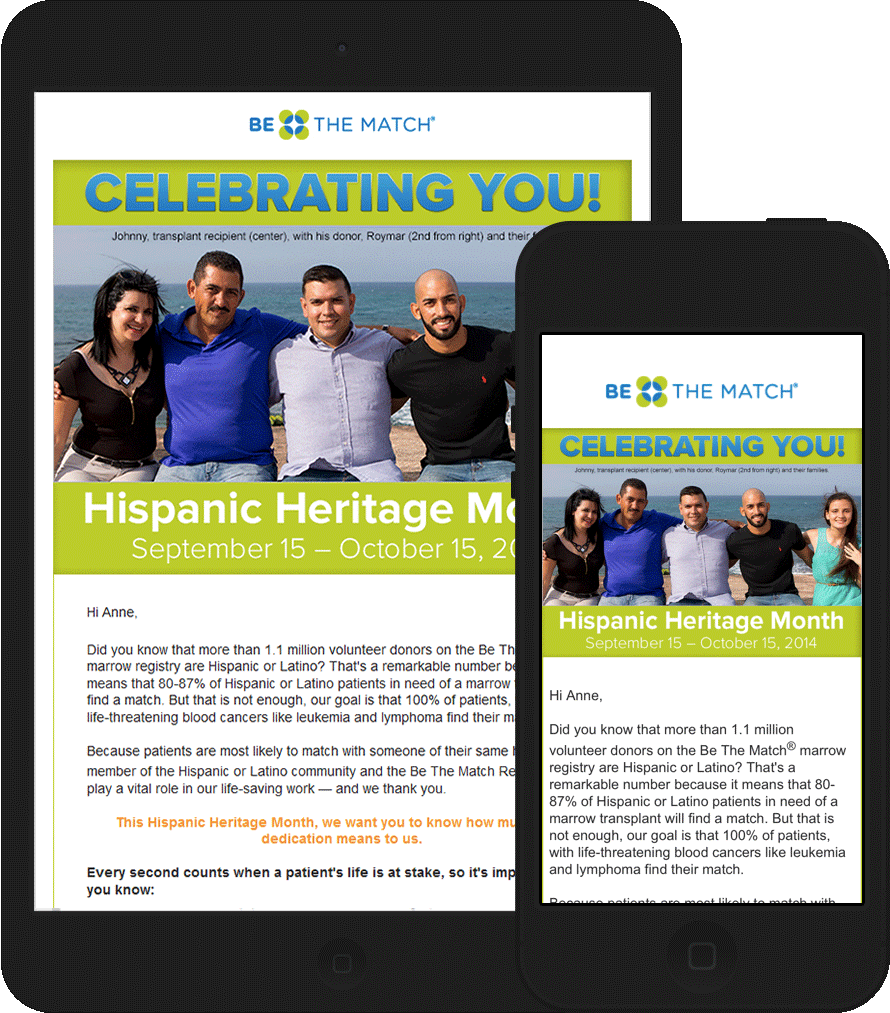
2014 Hispanic Heritage Month - Tissue Donation
Features
This email was created with a hybrid coding technique.
Challenges
This email uses images for buttons due to client specifications. The footer links are not fully optimized for mobile due to the vertical separators between them. However, this issue was resolved in the series (tissue donation recruitment series above) sent after this email.
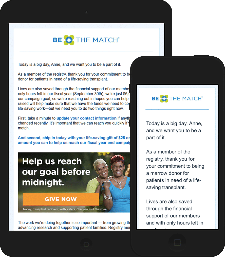
Monetary Donation Request - Tissue Donation
Features
This email is responsive.
Challenges
One of the footer links is a larger font size, and the subfooter is a smaller-than-practical font size due to client specifications.
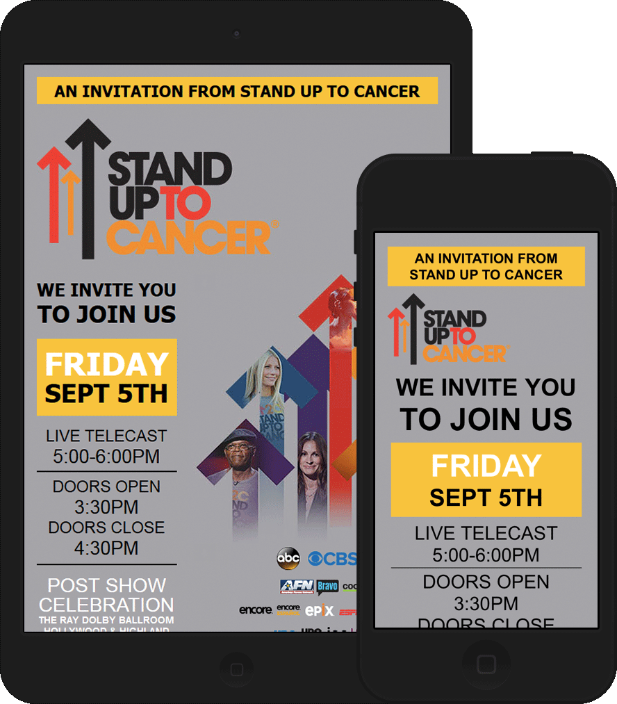
Cancer Benefit Invitation
Features
This email is responsive. The CTA is an HTML button and uses CSS3 drop shadows.
Challenges
The original design for this email had the logo and large left-aligned image starting at the same height. I shifted the large image down to keep a two-column responsive layout.
Anne's Email Creed
All my emails are hand-coded. I shall use no WYSIWYG, code no image maps, and seek no short-cuts.
I shall rely solely on no media query and forsake no inline styling.
I shall practice progressive enhancement and test all emails in every major email client.
I am the optimized layout. I am the nested table. I am the styled alt text, the choice of HTML elements, the attractive email even with images blocked.
I pledge to always code my emails the right way the first time.